SACS Consulting
Social Media Banner Design
Case Study
Palette
Social Media Banner for SACS Consulting – YouTube, LinkedIn, Facebook & Zoom
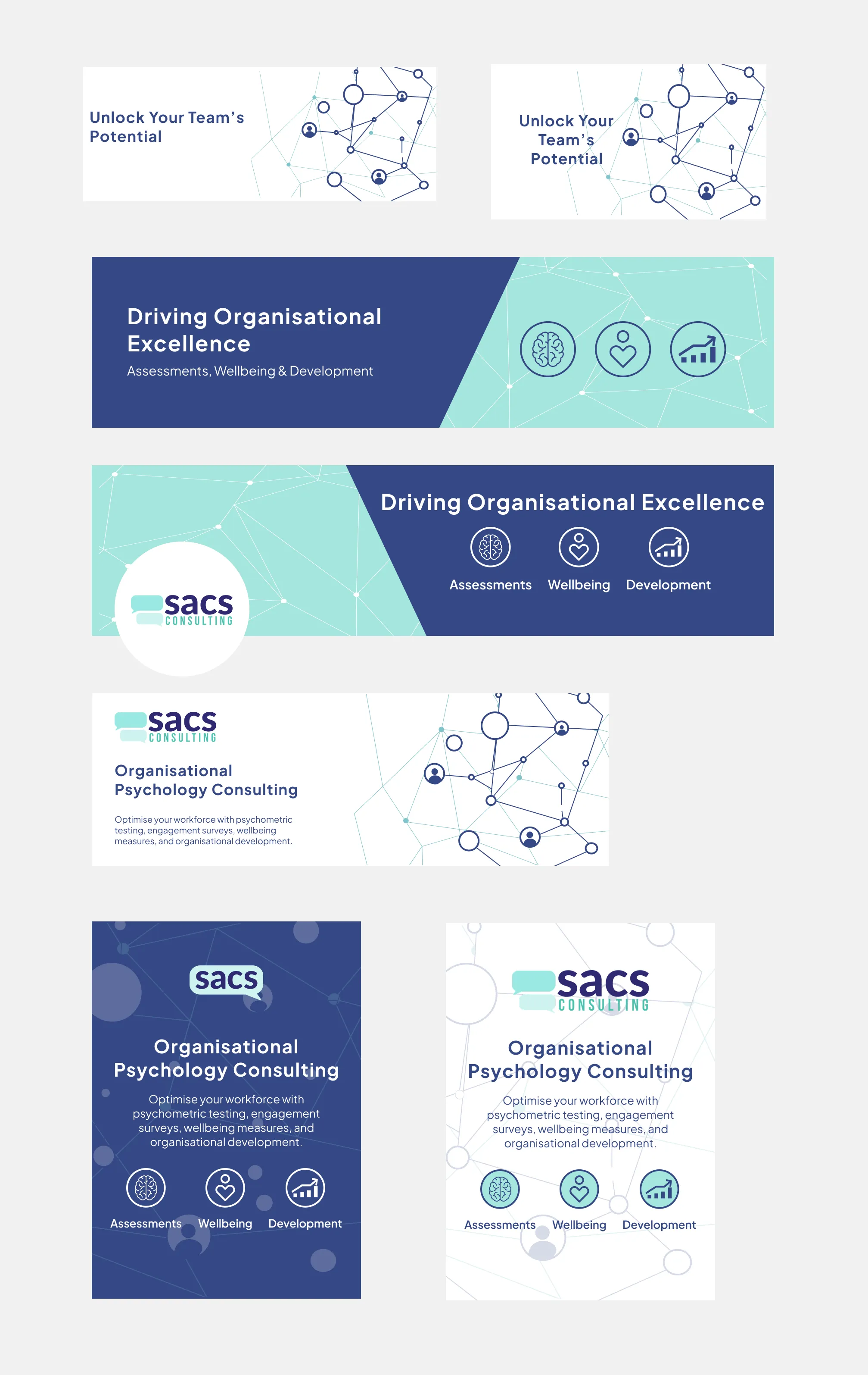
SACS Consulting Social Media Banner
Project Objectives
The goal of the project was a comprehensive overhaul of the social media presence for SACS Consulting—a Melbourne-based organizational psychology and HR advisory firm. The client required a cohesive, redesigned banner suite across four major platforms (YouTube, LinkedIn, Facebook, and Zoom), aligning seamlessly with the visual direction of their newly updated corporate website. The scope went beyond pure graphic asset production, requiring meticulous aspect ratio optimization, safe zone compliance for diverse screens, and accessibility standards integration.
Target Audience
SACS Consulting operates in a strict B2B ecosystem: their core audience consists of HR practitioners, corporate decision-makers, and talent acquisition executives seeking psychometric testing and organizational development services. Consequently, the visual communication had to project absolute professionalism, high trust, and immediate clarity—especially on premium corporate networking spaces like LinkedIn.
Creative Direction
The baseline for the creative execution was derived from the client’s brand identity guidelines: four fixed brand colors (navy #2F2971, mid-blue #0C75C0, bright teal #9AE7E0, and black), alongside the Plus Jakarta Sans typography family. The corporate website’s established aesthetic—clean, geometric, and data-driven—informed the banner suite’s style. An abstract vector illustration comprised of connected nodes and network paths encapsulates the firm’s core profile: human connection and organizational alignment. The production of two distinct variants (white typography on navy, and dark typography on white backgrounds) ensures the brand remains cohesive across varied platform layouts and display modes.
Design Elements
The visual foundation relies heavily on the interconnected network illustration, acting as a metaphor for human relationships and organizational structures. Three specialized linear icons—the brain (Assessments), the heart (Wellbeing), and the growth chart (Development)—distill the firm’s service pillars into minimal, legible symbols. The balanced navy-teal palette communicates corporate authority and approachable expertise simultaneously. The choice of Plus Jakarta Sans lends a contemporary yet profoundly human personality to all copy blocks.
Platform Asset Structure
The final deliverables were built on highly responsive layout principles, engineered to dynamically fit desktop, tablet, and mobile interface variations. All focal information, key taglines, and graphic indicators were restricted to precise safe-zone matrices to prevent cropping by platform profile avatars or system UI overlays. Text tracking, color contrast ratio configurations, and visual weight balances were systematically vetted to guarantee maximum readability and seamless cross-platform asset synchronization.