Eugene Mursky Pianist
Web Design
Case Study
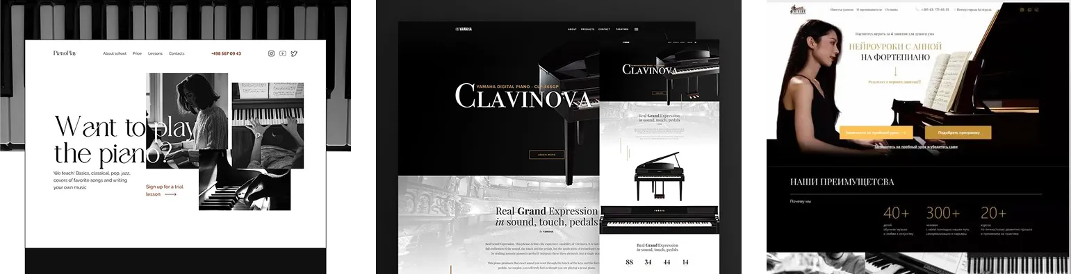
Inspiration
Eugene Mursky Pianist Web Design
Eugene Mursky Pianist Web Design
Project Objectives
The goal of the project was a complete visual overhaul of the existing WordPress website for international concert pianist Eugene Mursky. Rather than adding new functionalities, the client desired a modern, elegant visual identity—a one-page layout that worthily reflects the essence of a classical musician performing on world stages, while visually harmonizing with the atmosphere of his latest album, “Quasi una Fantasia”. The project required a strong command of WordPress development coupled with a commitment to a long-term professional relationship, as the client intends to rely on the designer for upcoming smaller projects, such as concert posters and CD covers.
Target Audience
The website simultaneously serves four distinct audiences: classical music enthusiasts looking for concert tickets; concert promoters and festival directors booking performers; music academy students and educators; and the press and music publishing sector. This diverse target group defined the content hierarchy: biographical material, the concert calendar, and press quotes received equal emphasis within the visual layout.
Creative Direction
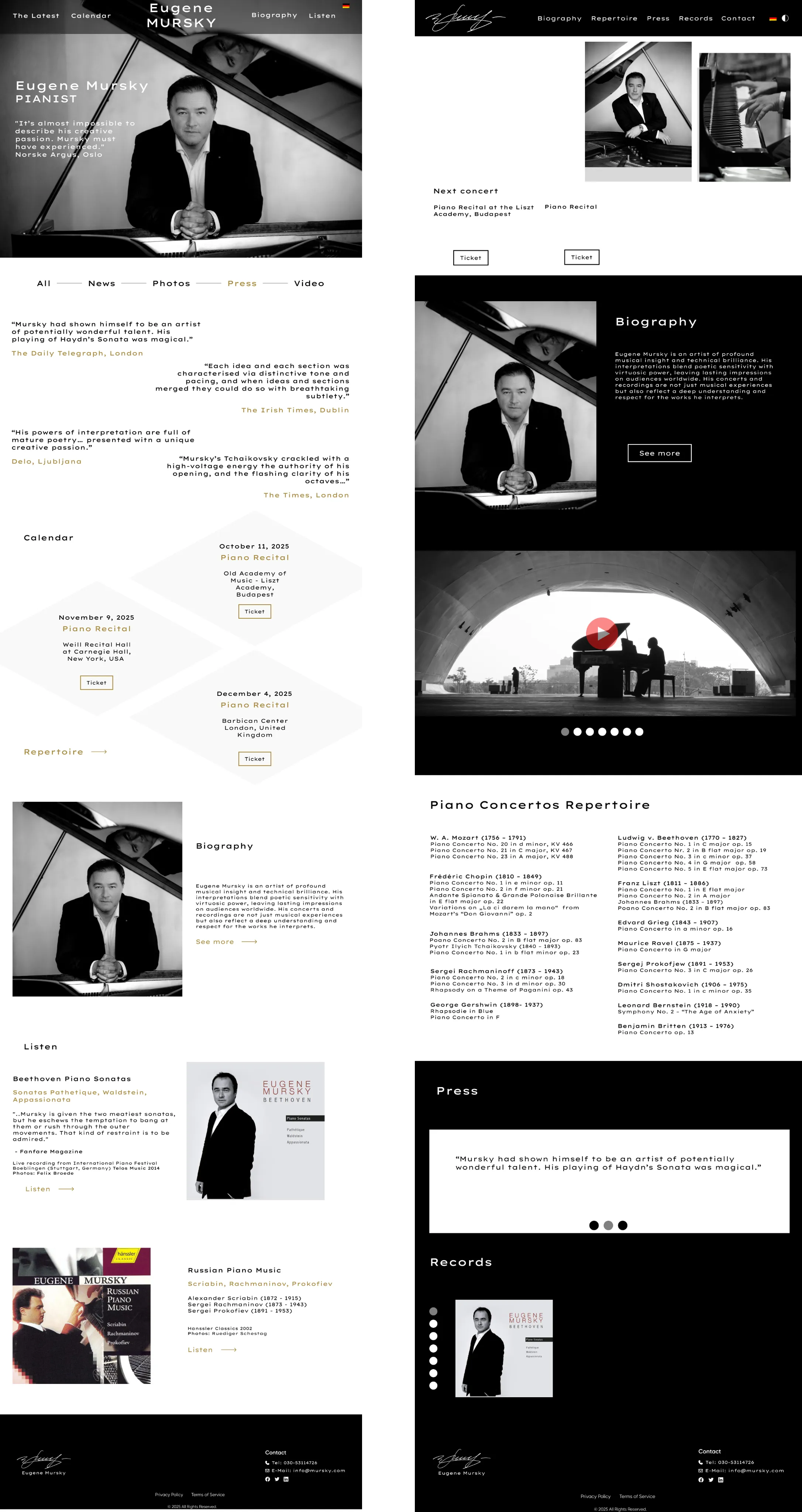
The guiding motto for the design was a sophisticated black-and-white aesthetic combining understated elegance with visual impact, punctuated by gold and warm yellow accents—colors that seamlessly resonate with the CD cover and promotional poster materials. The brief explicitly prohibited cluttered layouts, gaudy colors, and template-like designs. The finalized design exists in two parallel variations: a dramatic, dark-themed version and a lighter, airy white-themed version—both following the exact same typographic and structural framework. In choosing the typography (Ephesis Bold, Lexend Tera, Adobe Fnt23), I sought a perfect balance between editorial elegance and modern minimalism.
Website Features
The one-page layout seamlessly guides visitors through the pianist’s entire portfolio: from the hero section through press reviews and the concert calendar to the biography, videos, repertoire, and discography. Navigation in both versions features a sticky header that provides smooth scrolling between sections. The website is bilingual (German/English), utilizing a bilateral structure. The CD sub-page is built as a standalone one-pager featuring audio samples, cover art, and direct purchase links. An integrated mini audio player, alongside Spotify and YouTube links, allows visitors to instantly immerse themselves in the music.
Design Elements
The backbone of the visual system is formed by high-resolution, black-and-white concert photography—these images set the mood and establish a personal tone for the entire site. The gold accent color (tones around #C9A84C) highlights concert dates, press quote sources, and CTA buttons, creating a visual hierarchy evocative of the luxury and classical music worlds. The typography deliberately blends editorial and clean sans-serif characters: names and major headings carry a distinct character, while body text remains effortlessly legible.
Website Structure & Layout
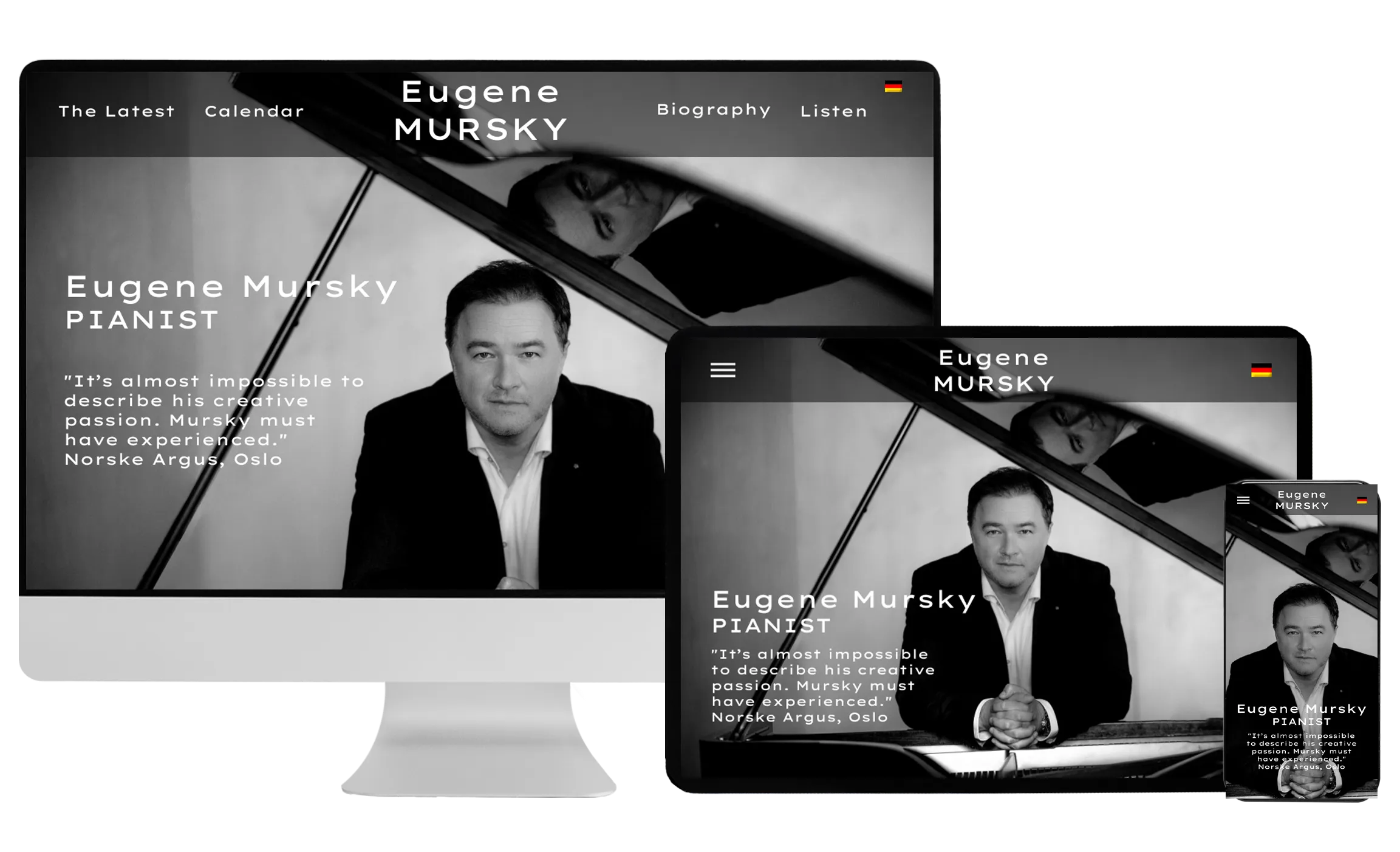
The WordPress-based site is fully responsive and optimized for both desktop and mobile views. The one-page structure is divided into the following sections: Hero (photo + quote), News/Press, Concert Calendar (with ticket links), Biography, Video, Repertoire, and Albums (Listen section). Smooth scrolling and subtle fade-in animations mirror the slower, meditative rhythm of classical music—without compromising page load speeds. The project serves as the foundation for a long-term collaboration, as the visual assets for future concert posters and CD designs will be anchored in this brand identity.