LPL Solar – Commercial Solar Energy Website
Web Design
Case Study
Inspiration

LPL Solar – Commercial Solar Energy Website
LPL Solar – Commercial Solar Energy Website
Project Objectives
The goal of the project was a complete visual and structural redesign of the website for LPL Solar, a North American utility-scale solar contractor. The client required a modern, enterprise-grade digital presence that represents their leading position in the renewable energy sector and clearly differentiates the company from competitors focused on residential solar. The design needed to be compatible with Avada Builder or Elementor, aligning perfectly with the existing logo and official color palette.
Target Audience
LPL Solar exclusively serves commercial and utility clients: corporate real estate developers, industrial facility operators, commercial property owners, and enterprise energy directors across the United States and Canada. The target audience is decision-oriented and data-driven—for them, proven experience, project references, and a reliable team are the key driving forces for conversion.
Creative Direction
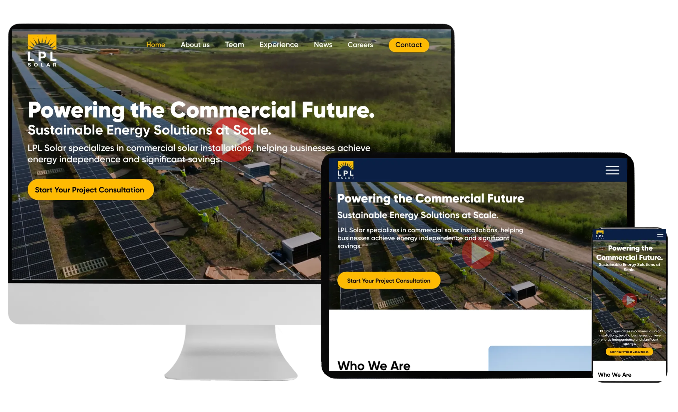
The starting point of the design was LPL Solar’s official brand identity: a dark blue base color paired with gold/yellow accents, using the Gilroy font family. This combination naturally carries the dynamic balance between a premium industrial sector and the optimism of solar energy. The hero section opens with a video background showcasing grand commercial solar installations, instantly establishing scale and credibility. The brief explicitly prohibited visual elements associated with residential housing; therefore, all photos and illustrations depict industrial, utility-scale environments.
Website Features
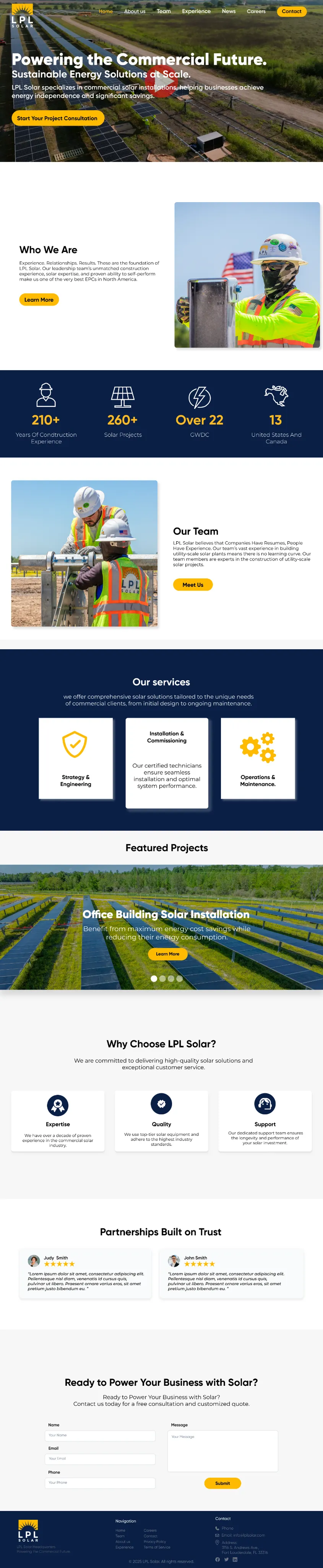
The 5+ page structure covers the following main sections: hero (video background + core message + CTA), an ‘About’ section with statistics (210+ years of experience, 260+ projects, 22+ GWDC across the USA and Canada), a team section, services broken down into three pillars (Strategy & Engineering, Installation & Commissioning, Operations & Maintenance), featured projects with a slider, a value proposition block (Expertise, Quality, Support), partner testimonials, and a consultation contact form. Navigation is simple, mobile-friendly, featuring a sticky header and a highlighted “Contact” button.
Design Elements
The visual system utilizes gold accents (tones around #F5A623) on a dark blue base (tones around #1A2B4A)—with CTA buttons, icons, and statistical data all appearing in this highlight color. The clean, outlined icon set (person, solar panel, lightning bolt, globe) is consistent and scalable. The project cards engage users with full-width photography and a yellow “Learn More” button. The team section emphasizes that the company’s true strength lies in its people and proven track record: “Companies Have Resumés, People Have Experience.”
Website Structure & Layout
The responsive, WordPress-based site is fully optimized for desktop, tablet, and mobile views. Scroll animations and hover effects are subtle yet engaging, bringing the site to life without compromising page load speeds. Avada/Elementor compatibility ensures that the client’s team can independently update content. The consultation form (Name, Email, Phone, Message) creates a low barrier to entry for potential clients, while the footer integrates navigation, contact details, and the logo into a unified layout.