Stock Roastery
Packaging Design
Case Study
Palette
Logo
Inspiration

Stock Roastery Packaging Design
Stock Roastery Packaging Design
Project Objectives
The goal of the project was to design a comprehensive packaging system for Stock Roastery, a coffee roastery and café operating in the UAE. The client required a cohesive, premium packaging suite that covers the two primary pillars of the business: wholesale coffee bean distribution to other cafés, and the daily operations of their own flagship coffee house. The design assets encompassed four key items: hot and cold beverage cups, coffee bean bags, and paper shopping bags.
Target Audience
Stock Roastery simultaneously serves two distinct target markets: B2B professional buyers—such as cafés and hospitality venues ordering premium roasted coffee beans—and retail end-consumers interacting with the brand directly at the café. The packaging system had to appeal to both groups, communicating corporate reliability and premium quality to business partners, while offering an aesthetic and memorable experience to café guests.
Creative Direction
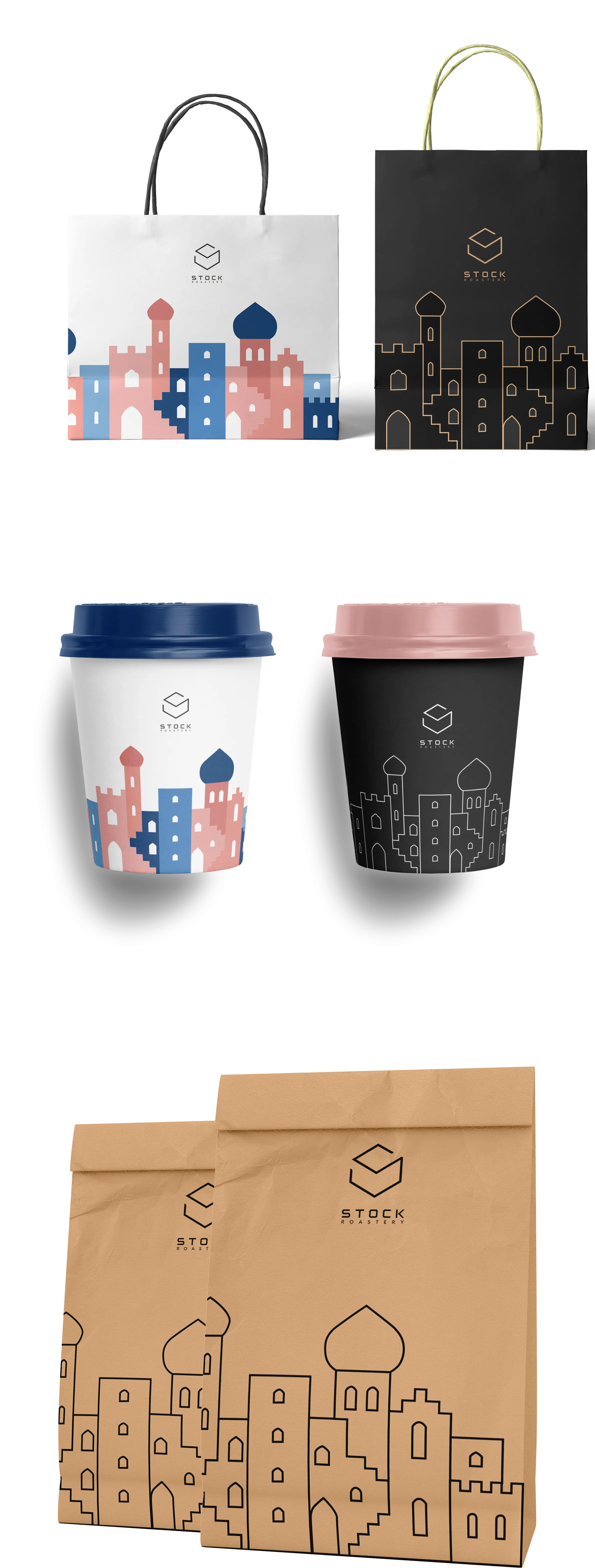
The baseline for the visual system was the provided corporate logo: a geometric, box-like emblem featuring the “STOCK ROASTERY” wordmark in a modern, tracked-out sans-serif typeface. This identity clearly established a clean, upmarket direction. Inspired by the urban cityscape of the UAE, I developed two distinct packaging variations—a playful, white-based version and an elegant, black-based version. The core illustration features a stylized skyline silhouette series reminiscent of Middle Eastern architecture, minarets, and domes, referencing the brand’s geographic roots while creating a unique, instantly recognizable visual signature.
Design Elements
The packaging suite lives in two parallel design concepts. On the white variation (used for shopping bags and cups), the cityscape illustration appears in vibrant coral pink and navy blue tones, creating a light, welcoming, and approachable mood. On the black variation, the same architectural motif returns as a refined gold line art illustration, elevating the product into the premium, giftable category. The kraft paper bag bridges these two concepts, featuring a black-and-gold version of the logo on its organic texture. Accompanying cup lids in coral and navy blue perfectly complement the distinct character of the beverage cups.