Traveling Brew
Graphic Design, Brand Identity
Case Study
Palette
Logo

Traveling Brew Brand Identity
Traveling Brew Brand Identity
Project Objectives
The goal of the project was to craft a comprehensive visual identity from scratch for a brand-new mobile coffee business. Operating under the name “Traveling Brew” (initially launched as Bruha Traveling), the project required complete brand identity guidelines—encompassing a logo system, color palette, typography, disposable coffee cup packaging, and the exterior wrap graphics for the coffee trailer. The design process was highly collaborative and structured across two iterations: based on the initial submission, the client provided constructive feedback, which was integrated into a refined, final design that ultimately secured first place in the competition.
Target Audience
The primary target market for Traveling Brew consists of attendees at local community gatherings, seasonal festivals, farmer’s markets, and school events. Consequently, the brand message needed to feel approachable, warm, and highly engaging. The business required an eye-catching design system capable of standing out immediately within busy, high-foot-traffic public environments.
Creative Direction
The design direction balanced the core brand values defined in the brief: elegant yet playful, modern yet personal, upmarket rather than budget-focused, and neatly balanced between feminine and masculine tones to ensure maximum approachability. The brief explicitly requested vibrant colors over dark, heavy tones; hence, the identity is built on a warm, energetic palette that projects freshness and positivity.
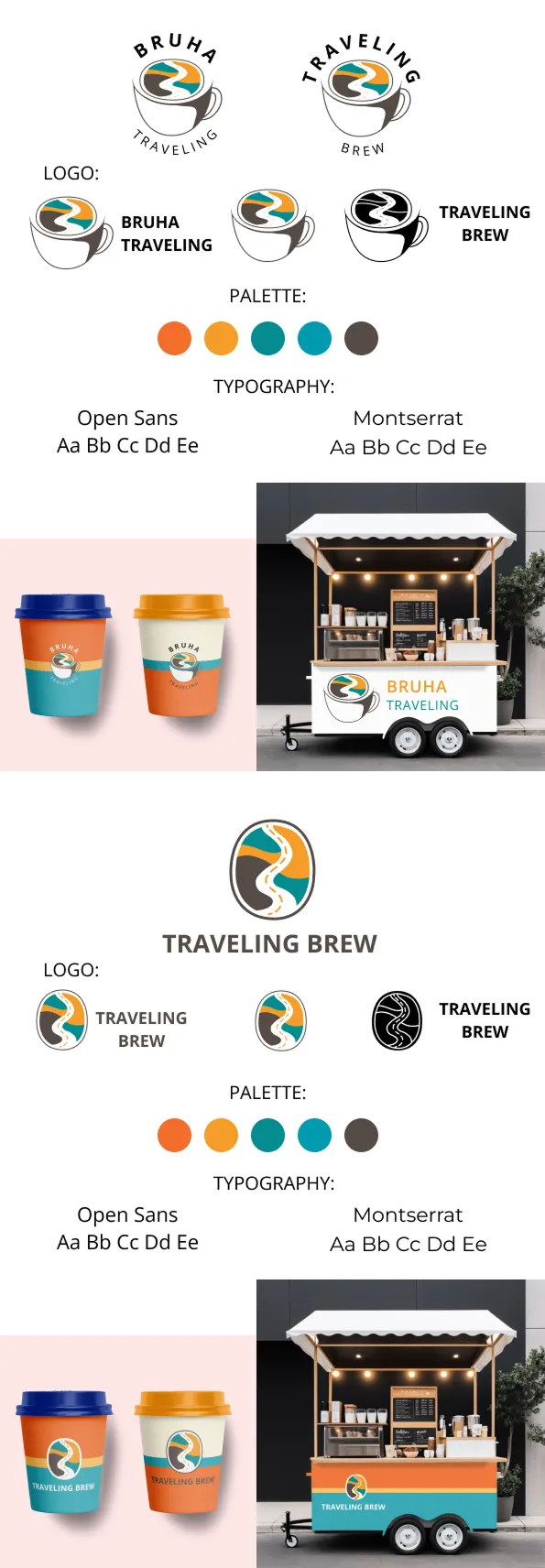
In the first iteration, the concept centered on a stylized coffee cup icon where the road motif seamlessly integrated into the silhouette as a latte art pattern—establishing a welcoming, direct connection to coffee culture.
Based on client feedback, the second and final iteration shifted focus: the cup was replaced with an oval emblem featuring a stylized winding road to emphasize movement, travel, and adventure. The brand typography was updated to be more cohesive and rich in character. Both versions maintained the same custom color palette—orange-red, mustard yellow, deep teal, and turquoise, anchored by a neutral grey accent—paired with the Open Sans and Montserrat typography family.
Design Elements
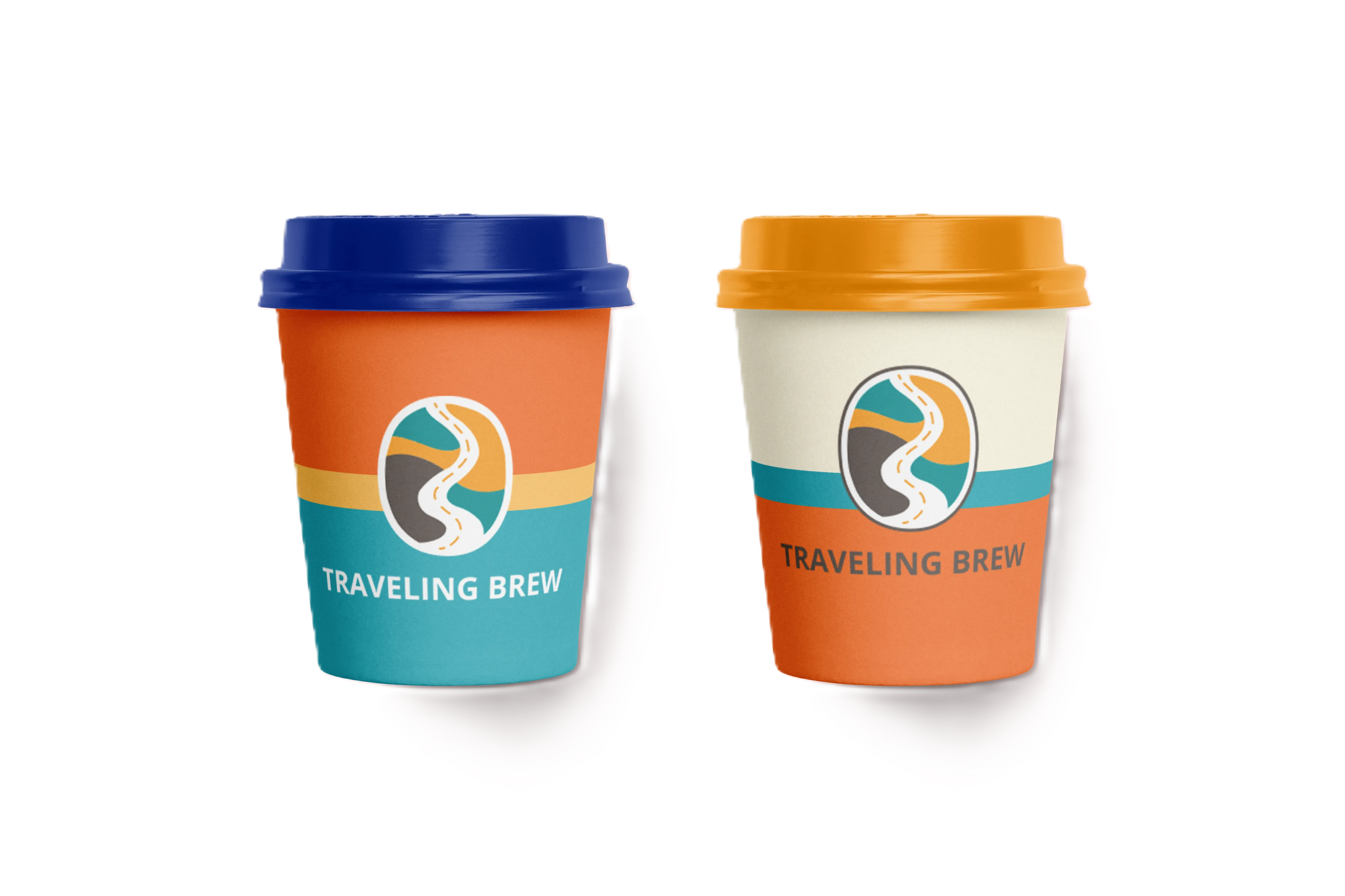
The core of the visual identity is the oval road-ribbon emblem, which subtly echoes both the contours of a coffee bean/cup and the essence of a journey. The color palette relies on vivid, warm tones designed to make the trailer instantly recognizable at any festival or market. The four primary colors—vibrant orange-red, mustard yellow, deep teal, and turquoise—deliver a dynamic yet highly organized aesthetic. The typography was carefully curated to complement the geometric nature of the emblem, utilizing an open and modern type pairing. The disposable coffee cup graphics utilize a bold color-blocking system that integrates flawlessly with the overall vehicle wrap design.
Design Process & Iteration
Traveling Brew was developed during a guaranteed-award DesignCrowd competition with a 200 USD budget, attracting 43 design submissions from 12 global designers. Following my initial concept submission, the client requested a targeted refinement: they wanted a stronger, more independent emblem in place of the explicit coffee cup shape to lean heavily into the “on-the-road” personality of the brand name. The modified, finalized design successfully won the client over and secured the project victory.
This dedicated Design Process section is particularly meaningful for a professional portfolio, as it explicitly demonstrates how user feedback was embraced and highlights design iteration as a vital part of a successful, client-focused outcome.